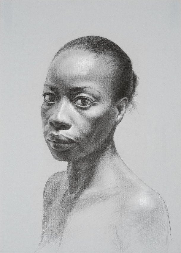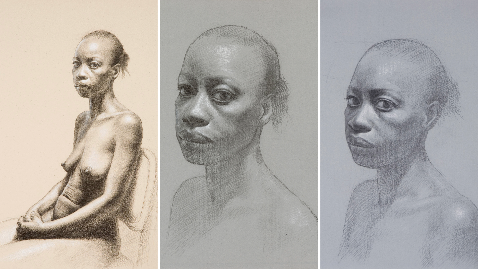
This drawing is of Connie who has been a long-time muse for my work. I do multiple drawings of the same model’s head, variants exploring subtle tilts or shifts of axis, facets, and emotions of my subject. All studies for a potential painting idea. This process allows me to truly understand the intricacies of Connie’s appearance and mood, going beyond a simple likeness to delve into the deeper aspects of her personality and the connection between artist and model.
It’s done with graphite heightened with white chalk on a heavyweight Tiziano Fabriano Blue Gray paper. The choice of using toned paper can significantly expedite the process of achieving a finished appearance. Due to the paper’s inherent tone serving as a bridge from darks to light and lights to darks. The heavyweight quality the paper offers a stable surface for the drawing and ensures that the paper can withstand the weight and friction of the many layers of hard graphite pencils.
Posing the model’s head so it is turned slightly toward the viewer echoes works by many past artists. The subtle three-quarters turn of Connie’s head slightly tilted down conjures up the subtle pose choices of Rogier van der Weyden, Leonardo, and Raphael. It’s the slight turn that emphasizes the subject’s eye contact with the viewer. It engages the viewer by giving the model the appearance of residing in the viewer’s space. By tilting the chin slightly down the eyes appear larger, which adds to the drawing’s psychological depth. I reinforce this by building up the level of finish closer to the subject’s eye. I strive to create volume through the use of linear marks that closely follow the form with variations in pressure. This technique is akin to traditional engraving or cross-hatching, which relies on carefully placed lines to build up values and shadows. By adjusting the pressure and density of these marks, I can effectively convey the play of light and shadow on the surface, adding depth and dimension to the drawing. I use white chalk to create a light value range rather than just to make white highlights pop in certain places. I build toward the forms that are closer to the light source in careful steps, which creates a developed sense of hierarchy throughout the drawing’s value range. This not only adds depth and dimension but also helps guide the viewer’s eye through the drawing, creating a strong focal point and a sense of realism.


